
This project is how the logo for Night Shift Comics came to be. Starting from a draft sketch from Christina Savino I made several different variations on the initial design, which you can see in this handy matrix graphic below.
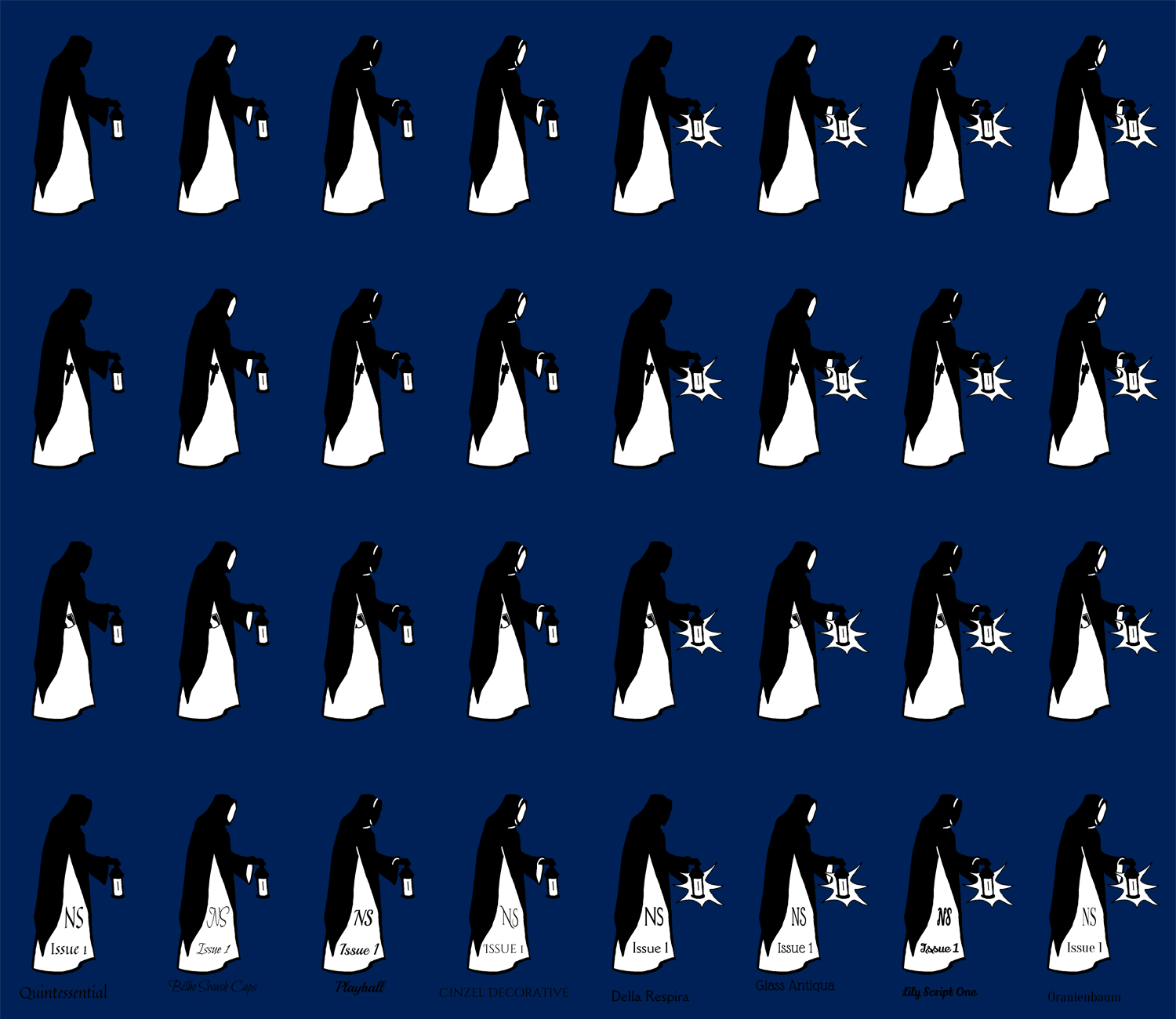
The eight figures on each line show the image with three variables, extra detail lines, showing the inside of the hood and sleave and glow from the lantern. The first three rows are a variance in what the figure is holding, either nothing, a knife, or a book. The final row is an example for eight different fonts in the style we were looking for. With all the options laid out here Christina and I decided to go with the last figure from the top row and use the Cinzel Decorative font. The final result being the logo you see below.
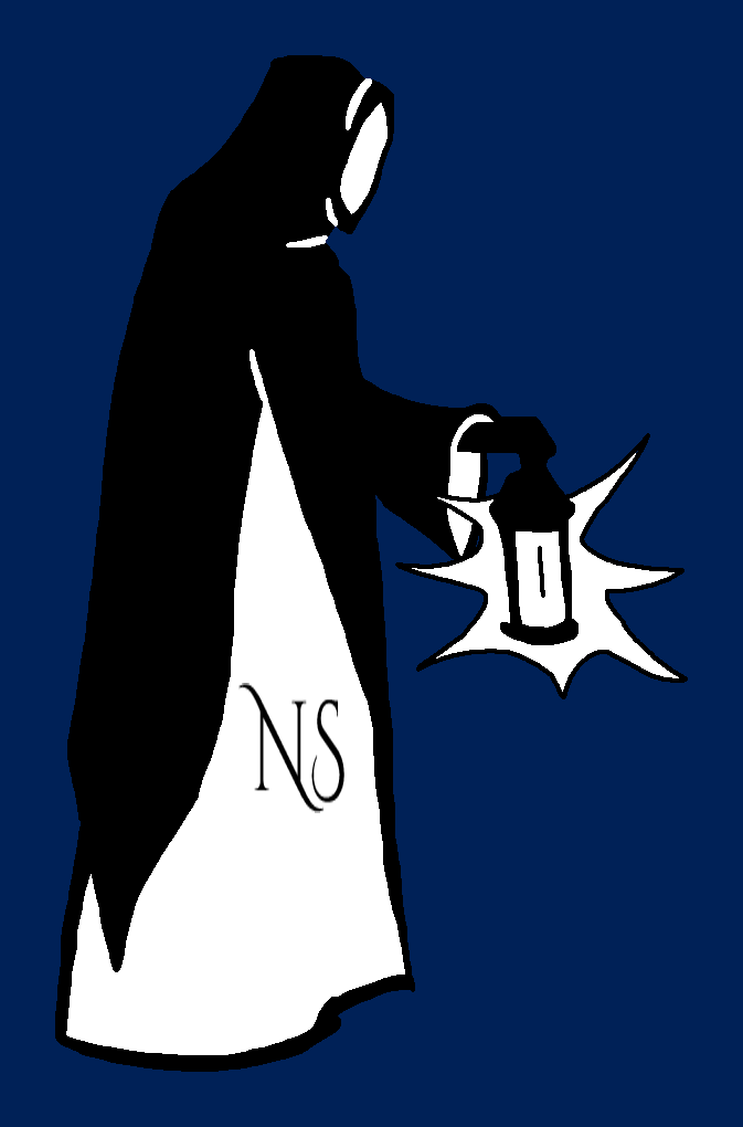
The logo is simple, yet has personality, and it's monochrome color scheme will make it easier to incorprate it into future designs

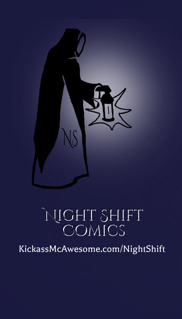
like the banner for our website,
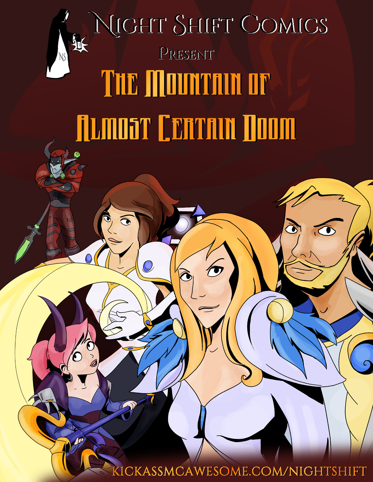
advertizing,
and our business cards.